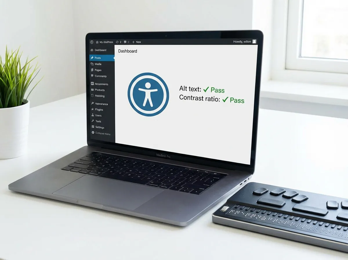
Improving accessibility in WordPress helps developers create websites that are easier to navigate, compliant with WCAG 2.1, and optimized for all users — including those with disabilities.
This guide lists several tips in six different areas to improve accessiblity in WordPress websites, covering semantic markup, ARIA roles, color contrast, and testing tools.
Table of Contents
6 Technical Ways to Improve Accessibility in WordPress
Accessibility in WordPress is often treated as a “nice to have”.
In reality, it’s one of those things that quietly impacts usability, SEO, performance, and legal compliance all at once.
In reality, it’s one of those things that quietly impacts usability, SEO, performance, and legal compliance all at once.
WordPress gives you a decent starting point, but accessibility is not automatic.
Themes, plugins, custom templates, and even small CSS choices can break it in subtle (and expensive) ways.
Themes, plugins, custom templates, and even small CSS choices can break it in subtle (and expensive) ways.
Instead of chasing every WCAG rule, let’s focus on six critical technical areas where WordPress sites usually fail — and where small fixes make a big difference.
Structure and Semantic Markup (The Foundation Everyone Breaks)
Accessibility starts with HTML structure.
Not ARIA. Not plugins. HTML.
A surprising number of WordPress themes still treat headings and layout as visual elements instead of semantic ones.
Not ARIA. Not plugins. HTML.
A surprising number of WordPress themes still treat headings and layout as visual elements instead of semantic ones.
Common issues:
What to focus on:
👉 If your theme templates (
header.php, page.php, single.php) aren’t semantically clean, no plugin will save you.Images and Media Accessibility in WordPress (Not Just “Add Alt Text”)
Alt text is often misunderstood or abused — especially in WordPress, where media uploads are reused everywhere.
Rules of thumb:
For audio and video:
Keyboard Navigation and Links (Where Most Sites Fail Silently)

If a site can’t be used with a keyboard, it’s not accessible. Period.
This is especially relevant in WordPress because:
This is especially relevant in WordPress because:
Critical fixes:
Quick test:
Open your site, don’t touch the mouse, and start pressing
If you get lost — so will your users.
Open your site, don’t touch the mouse, and start pressing
Tab.If you get lost — so will your users.
Color Contrast and Typography (Design Choices That Exclude)
Accessibility isn’t about ugly design — it’s about readable design.
Common problems:
Baseline rules:
Tools like Chrome Lighthouse catch many contrast issues automatically — use them early, not after launch.
Forms and Dynamic Components (Accessibility Meets Conversion)
Forms are where accessibility and business goals collide.
Typical WordPress issues:
Best practices:
Many form plugins (Gravity Forms, WPForms) do a decent job — until you customize them. That’s usually where accessibility breaks.
ARIA Roles, Language, and Motion Preferences (Use With Care)
ARIA is powerful — and frequently misused.
Key points:
Motion matters too:
Regular checks with W3C Validator and axe DevTools help catch issues before they pile up.
🧪 Accessibility Testing Is Not a One-Time Task
Accessibility is a process, not a checkbox.
Make these part of your workflow:
You’ll catch things automated tools never will.
🧩 Useful WordPress Accessibility Plugins (With Realistic Expectations)
Plugins can help — but they’re not magic.
Worth checking out:
Use them to support good development practices, not to replace them.
Final Thought
Improving accessibility in WordPress isn’t about ticking WCAG boxes.
It’s about building sites that work better for everyone — faster, clearer, more robust, and easier to use.
And yes: accessible sites usually rank better too. Funny how that works.
It’s about building sites that work better for everyone — faster, clearer, more robust, and easier to use.
And yes: accessible sites usually rank better too. Funny how that works.
Leave a Reply