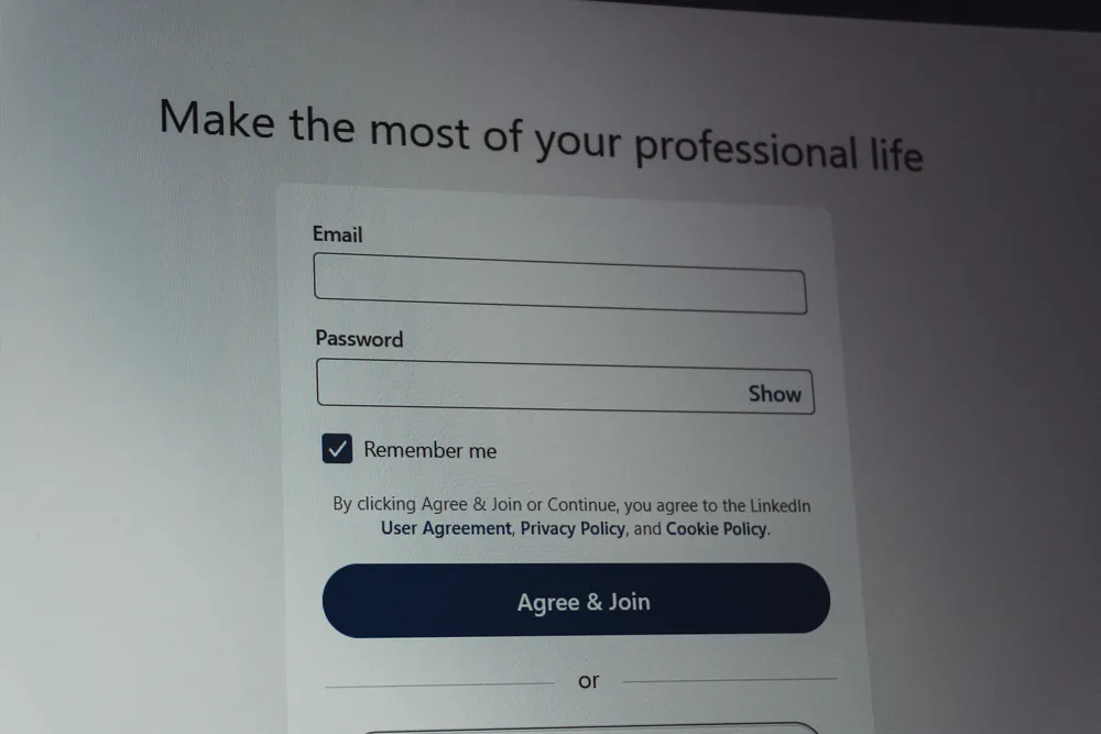
Forms are where accessibility problems become real usability problems.
A contact form that submits but doesn’t announce errors, a modal that traps focus, or an input without a proper label can make a WordPress site unusable for keyboard and screen reader users — even if everything looks fine visually.
Let’s break down what actually matters when building accessible forms in WordPress.
Accessible Forms in WordPress: Labels, Errors and ARIA Done Right
Table of Contents
Labels Are Not Optional
Every form control must have an explicit label.
This is not a stylistic recommendation — it’s a WCAG requirement.
This is not a stylistic recommendation — it’s a WCAG requirement.
What works
<label for="email">Email address</label>
<input id="email" type="email" />What doesn’t
If you need to hide labels visually, hide them visually, not semantically.
If a screen reader can’t announce what an input is for, the form is broken.
If a screen reader can’t announce what an input is for, the form is broken.
aria-label vs <label> (When to Use Each)
Example (acceptable fallback):
<input type="search" aria-label="Search articles" />ARIA is not a shortcut — it’s a backup.
Accessible Error Messages: aria-live Matters
A common failure in WordPress forms is error feedback that is only visual.
Red borders, icons, or text updates are not announced automatically by screen readers.
Use live regions:
Red borders, icons, or text updates are not announced automatically by screen readers.
Use live regions:
<div class="form-error" aria-live="polite">
  Please enter a valid email address.
</div>Without this, users may submit a form and have no idea what went wrong.
Focus Management in Modals and Dynamic Forms
Forms often live inside:
If focus is not managed correctly:
Minimum requirements:
ARIA roles help, but JavaScript logic is required.
<div role="dialog" aria-modal="true">ARIA alone does not manage focus — it only describes it.
ARIA Roles for Custom Form Components
Custom UI components (toggles, sliders, custom selects) are common in WordPress plugins.
If you build one:
If you build one:
If native elements are not an option, you must implement:
No ARIA is better than wrong ARIA.
Form Plugins: What They Get Right (and What They Don’t)
Popular plugins like Gravity Forms, WPForms, Forminator and Contact Form 7 provide a good base, but:
Accessibility is a shared responsibility between:
Assume nothing is accessible by default — always test.
A Practical Accessibility Checklist for WordPress Forms
Before calling a form “accessible”, verify that:
If one of these fails, the form is functionally broken — even if it looks perfect.
Final Thought
Accessible forms are not about adding ARIA everywhere.
They’re about respecting how users interact without sight or mouse.
If a form can’t be completed with a keyboard and a screen reader, it’s not usable.
They’re about respecting how users interact without sight or mouse.
If a form can’t be completed with a keyboard and a screen reader, it’s not usable.
🔗 This article is part of a broader guide on the most critical accessibility areas in WordPress: 6 Expert Techniques to Enhance Accessibility in WordPress


Leave a Reply